Eval Labs typography should make source truth easy to scan: strong headings, readable body text, restrained captions, and calm spacing.
Overall rhythm
Eval Labs docs should feel:
clean
spacious
calm
source-truth oriented
a dense wiki dump
a marketing brochure
a technical wall of gray
a dashboard screenshot graveyard
Headings
Headings should be direct and useful.
Good:
What Eval Labs Is For
Current Live Status
The Two Testing Paths
Reviewer Rule
Overview
Introduction
Miscellaneous Notes
Additional Thoughts
Body text
Body text should be normal reading size and dark enough to feel like primary content.
For the homepage Logo/Text Table, the right-side copy should read as body text, not subheading text.
The relevant CSS knobs are:
--eval-logo-row-copy-size: 16px;
--eval-logo-row-copy-line-height: 1.62;
Captions
Captions should be short, italic, and factual.
Good:
Eval Labs Logo.
Review Queue with scoring controls.
Custom suite loaded for regression testing.
Code blocks
Use code blocks for:
- exact prompts
- JSON examples
- route names
- environment values
- repeatable workflow loops
Do not use code blocks just to make ordinary prose look important.
Callouts
Use callouts when a point needs to stand apart from normal prose.
Do not make every paragraph a callout.
Recommended use:
<Note>
One-line summary of the note.
</Note>
<Note>
Evaluation-specific note.
</Note>

<Check>
Confirmed behavior or known-good status.
</Check>

<Warning>
Regression or quality risk.
</Warning>
Screenshot rhythm
Screenshots should support the workflow, not dominate it.
Best pattern:
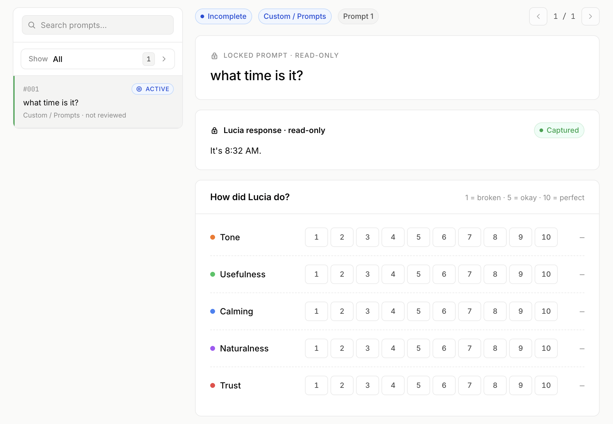
_Review Queue. Human evaluators score Lucia’s responses and save review notes._
Eval interaction visual rhythm
The review interface should feel calm, guided, and native.
For scoring controls, prefer:
semantic confidence bars
guided question cards
clear selected states
restrained color
low visual noise
cyberpunk controls
gamer gradients
harsh stoplight color
busy dashboards
dense form grids