> ## Documentation Index
> Fetch the complete documentation index at: https://helloluciallc.com/llms.txt
> Use this file to discover all available pages before exploring further.
# Typography and Visual Rhythm
Eval Labs typography should make source truth easy to scan: strong headings, readable body text, restrained captions, and calm spacing.
***
## Overall rhythm
Eval Labs docs should feel:
```text theme={"dark"}
clean
spacious
calm
source-truth oriented
```
They should not feel like:
```text theme={"dark"}
a dense wiki dump
a marketing brochure
a technical wall of gray
a dashboard screenshot graveyard
```
***
## Headings
Headings should be direct and useful.
Good:
```text theme={"dark"}
What Eval Labs Is For
Current Live Status
The Two Testing Paths
Reviewer Rule
```
Weak:
```text theme={"dark"}
Overview
Introduction
Miscellaneous Notes
Additional Thoughts
```
***
## Body text
Body text should be normal reading size and dark enough to feel like primary content.
For the homepage Logo/Text Table, the right-side copy should read as body text, not subheading text.
The relevant CSS knobs are:
```css theme={"dark"}
--eval-logo-row-copy-size: 16px;
--eval-logo-row-copy-line-height: 1.62;
```
***
## Captions
Captions should be short, italic, and factual.
Good:
```text theme={"dark"}
Eval Labs Logo.
Review Queue with scoring controls.
Custom suite loaded for regression testing.
```
Avoid long captions that become paragraphs.
***
## Code blocks
Use code blocks for:
* exact prompts
* JSON examples
* route names
* environment values
* repeatable workflow loops
Do not use code blocks just to make ordinary prose look important.
***
## Callouts
Use callouts when a point needs to stand apart from normal prose.
Do not make every paragraph a callout.
Recommended use:
```md theme={"dark"}
One-line summary of the note.
```
Other useful types:
```md theme={"dark"}
Evaluation-specific note.
Confirmed behavior or known-good status.
Regression or quality risk.
```
***
## Screenshot rhythm
Screenshots should support the workflow, not dominate it.
Best pattern:
```md theme={"dark"}
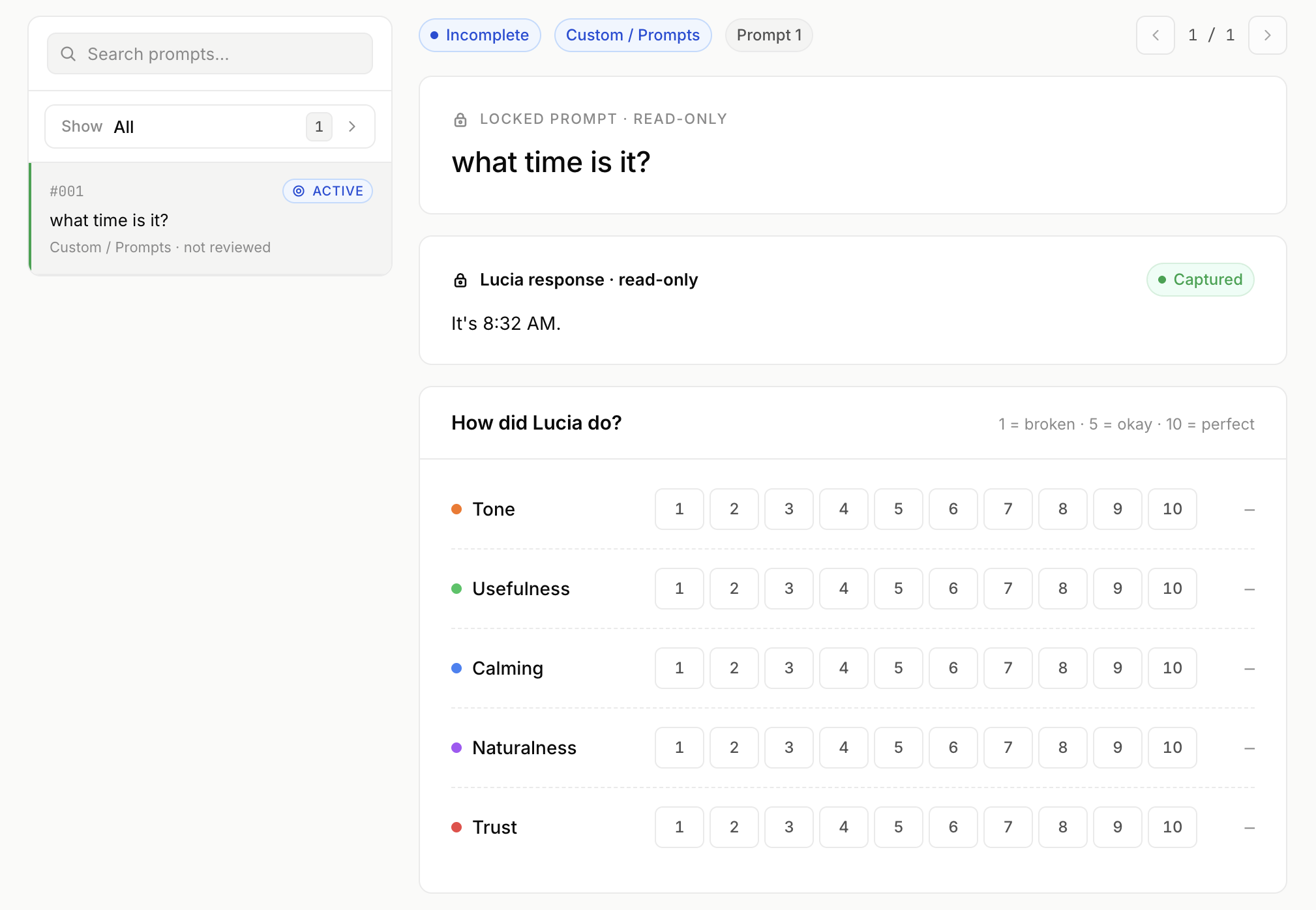
_Review Queue. Human evaluators score Lucia’s responses and save review notes._
```
Keep screenshot captions plain.
***
## Eval interaction visual rhythm
The review interface should feel calm, guided, and native.
For scoring controls, prefer:
```text theme={"dark"}
semantic confidence bars
guided question cards
clear selected states
restrained color
low visual noise
```
Avoid:
```text theme={"dark"}
cyberpunk controls
gamer gradients
harsh stoplight color
busy dashboards
dense form grids
```
Visual rhythm is part of evaluation quality because it affects reviewer fatigue and confidence.